Getting Started: MML with React
Why React?
While the MML web client functions effectively with HTML and JavaScript, integrating it with React offers distinct advantages for dynamic and complex applications. React's component-based architecture promotes modular design and reusability, aligning well with MML's modular nature. It offers efficient state management, allowing for responsive UIs with real-time updates and smooth user experiences.
How To
To start working with react, we recommend using our
React starter project as a start. We will
provide a more detailed guide in the future on how to use MML with any other frontend framework.
Clone the repository, remove all the children in the App component in index.tsx, except for
Light, and follow along with this guide. Run npm install to install the dependencies and
npm run dev to start the development server. You can then open the project in your browser at
http://localhost:20205. The entry point for the application is mml-document/src/index.tsx.
Your First React Component
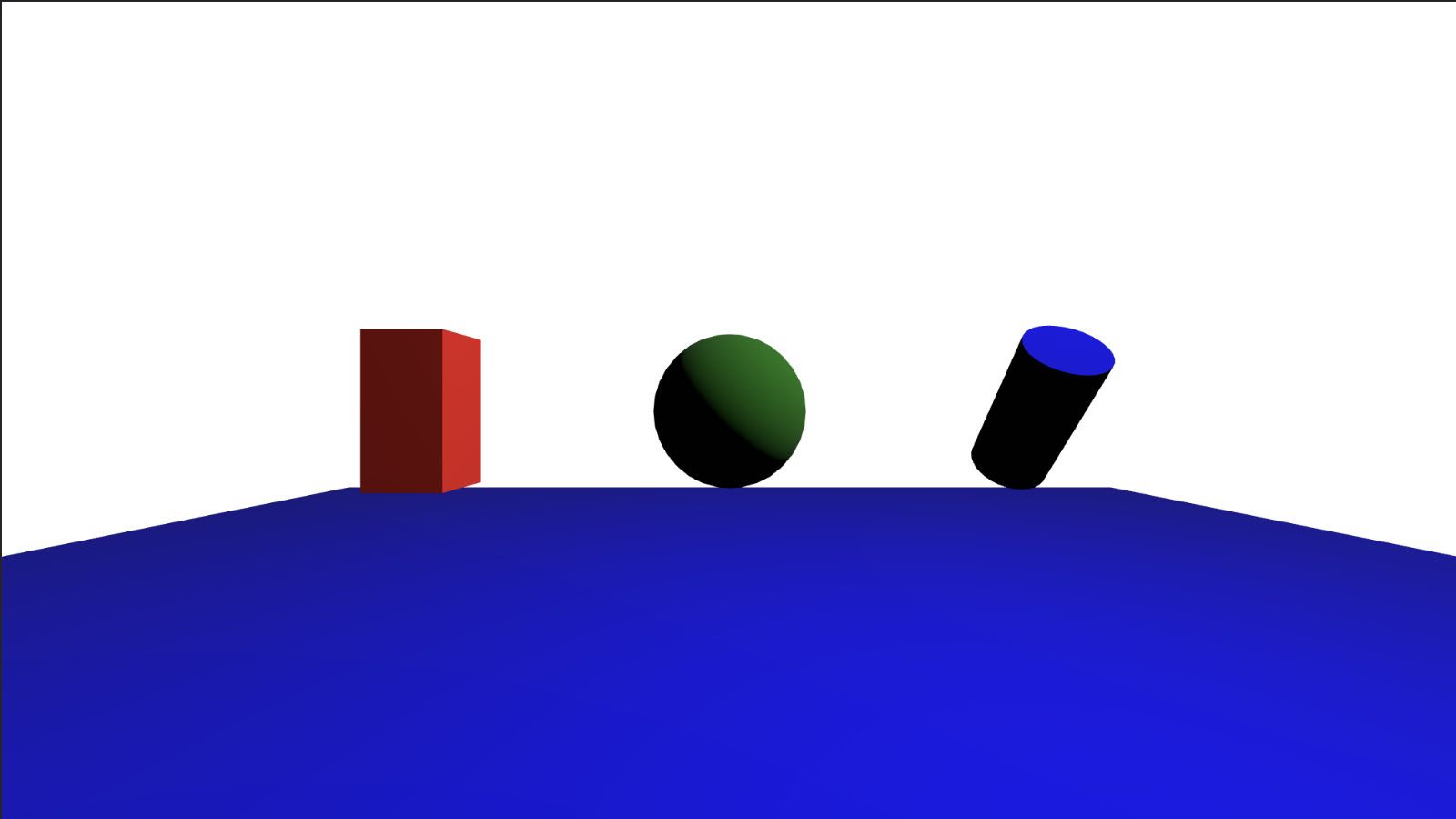
In index.tsx there is a simple React component that renders an empty scene with a m-light
shining from the top. Let's try adding a few elements:
As you can see from the code above, MML elements can be rendered like any other HTML element in JSX.
You can use any MML element and pass its attributes as props. There is no need to use camelCase for
the attributes names and you can use strings for all values like on m-cylinder.
We can use React hooks to add some interactivity to our scene. Let's add some logic to change the color of the cube when clicking on it
And there it is. Click on the cube and it will change its color. We can also use the useEffect
hook to set up side-effects, for example an interval that changes the cube color randomly every
second.
You will see the m-cube element change color every second.
We can also add animations to our elements using the m-attr-anim. Let's add a rotation animation
to the cylinder.
Now the m-cylinder will slowly rotate around the x-axis.
Reusability with React
React's component-based architecture promotes reusability and modularity. This aligns well with
MML's modular nature, allowing for the creation of reusable components that can be easily integrated
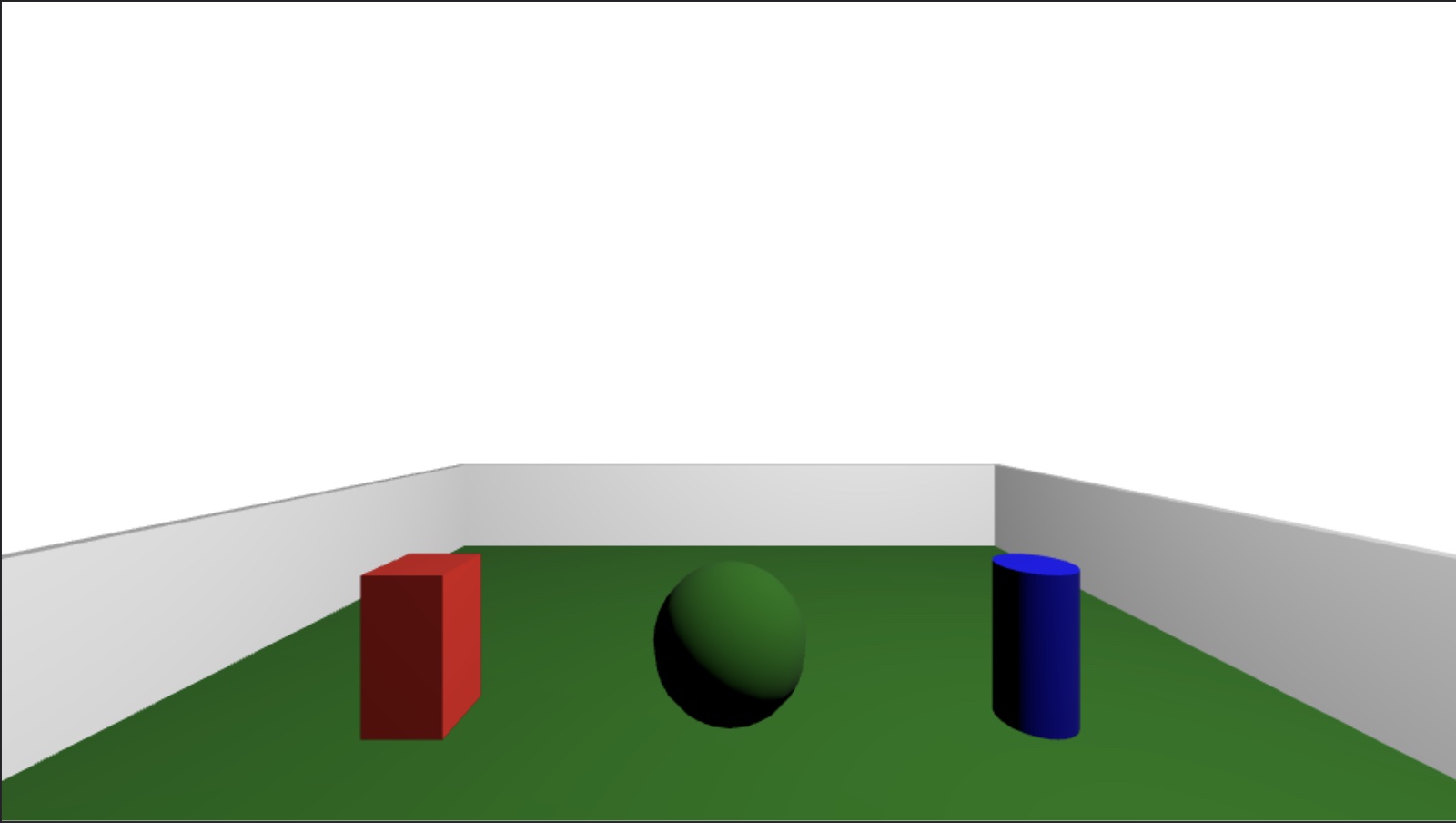
into other projects. For example, we can create a MMLScene component that renders a scene with a
light and a plane that accepts children to render other elements.
We can then use this component in our App component to render the current scene and reuse it in
other parts of our application.
Of course a component that doesn't accept any props and just renders a scene is not very useful.
Let's add some props to our MMLScene component to make it more flexible.
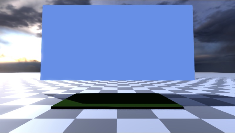
Now we can use our MMLScene component to render different scenes with planes of different colors
and sizes.
And we can see the result in the image below.
Let's extend this concept by creating a room component. Each room consists of a floor and four
walls. We can use the MMLScene component we created before to render the room.
We can then use this component to create a room in App.tsx and add the same elements we had before
in it.
But why limit ourselves to one room? We can easily render multiple rooms by using the position
properties x, y and z on the Room component. We can also group them in an m-group to be
able to move them around if needed.
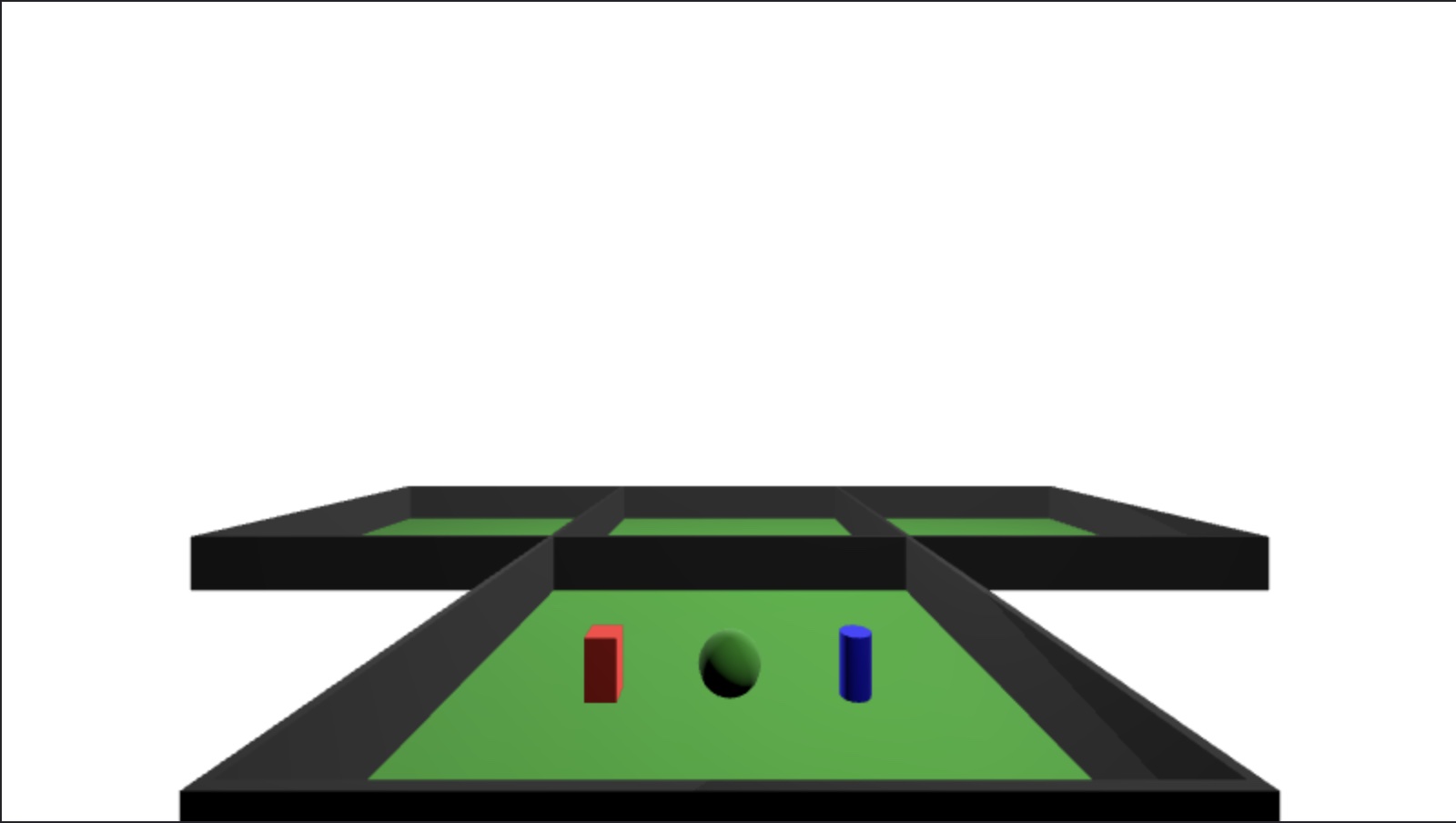
The examples above can be expanded to create entire buildings or even cities in MML. You can find a more complex example of room with customizable walls with windows and doors in the MML React Space repo.
MML Events in React
Some MML elements have events that can be used to trigger actions in the scene. Unfortunately, React doesn't allow us to pass those events directly to the elements. We need to use a few workarounds to be able to use them. We are going to see a few common cases in the sections below. These examples require a user avatar in the scene. We recommend using MML React Space to play around with these examples.
Collision Events
Collision events are triggered when a user collides with an MML element. Let's create an example
that uses all the collision events available in MML. We are going to use a m-cube as a platform
and a m-cube as a panel to display the position of the users that are currently in the scene. We
are going to use the collisionstart event to add the users to the panel and the collisionend
event to remove the users from the panel. We are also going to use the collisionmove event to
update the position of the user in the panel.
Let's start with the basic scene structure.
We can see the panel and the platform in the image above. Let's add the logic to handle the
collisionstart events.
In the above example, a Map stores the scene's users, with connectionId as the key and an object detailing the user's
color and position as the value. The createUsers function generates a new user if one doesn't exist. A React ref fetches
the platform element, while useEffect manages event listeners upon component mounting and unmounting. Stepping onto the
platform triggers a collisionstart event, adding the user to the users map and prompting a re-render to display the user
in the panel.
Let's handle the collisionmove event now.
To update the user's position in the panel, we employ the setCubePosition function. Additionally, the setUsers callback
ensures correct state updating. To accurately display the user position, the x and z coordinates are doubled, as the
panel is twice the platform size.
Finally, let's handle users leaving the platform and disconnections.
The clearUser function removes a user from the users map, and we listen for the disconnected event to do the same when a
user disconnects. The setUsers callback ensures correct state updating.
Position Probe Events
We can take inspiration from the previous example to create a position probe that shows a cube above the user's head when they move around the position probe.
As you can see, it's very similar to the previous example. The main difference is that the cube now appears on top of the user and tracks their rotation as well.
Animations
Animations are a great way to add interactivity to your scenes. m-attr-anim allows you to animate
almost any attribute of an MML element.
We have already seen how to use m-attr-anim in the
simple component example. Let's see how we can use it to create
animations programmatically using React.
Animating on Click
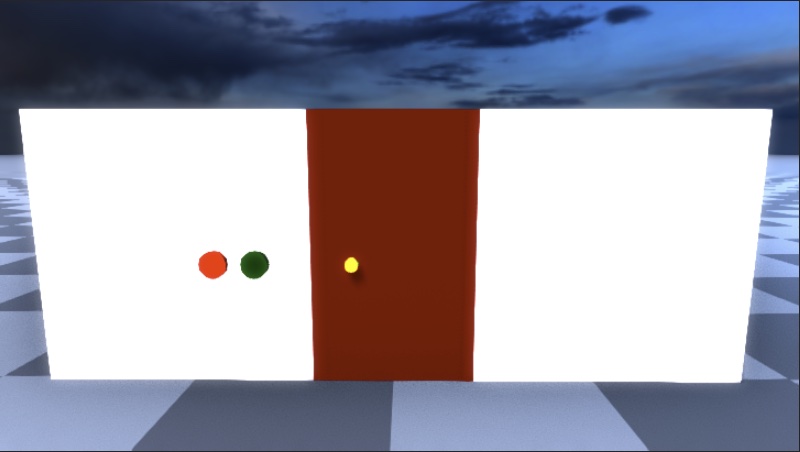
Let's imagine our experience has a door with a couple of buttons to open and close it. Let's first create our door component.
Then let's create a wall in which we will place the door and the buttons.
The wall is made of 2 cubes per side, one for the wall, and one for the door frame. The result should look like the image below.
Now let's add the logic to open and close the door automatically. We are going to use the
m-attr-anim element to animate the ry attribute of the door with ping-pong set as true so
that the value animates back and forth.
It's working, but something isn't right. The rotation is happening around the center of the door,
but we want it to happen around the left side of the door. We can fix this by adding a m-group
element around the door and offsetting the x attribute.
Now the door opens and closes correctly. Let's add the logic to the buttons to open and close the door when they are clicked.
We have 2 pieces of state, isOpen and startTime. isOpen is used to know whether the door is
open or closed and to change the animation accordingly (we're using the same m-attr-anim element
to open and close the door). startTime is used to know when the animation needs to start. We are
using the document.timeline.currentTime to get the current time when the button is clicked and
then we are assigning it to startTime.
Animating on Collision
Building on the concept of animating elements through m-attr-anim, let's talk about a more
interactive scenario: animating doors based on user collision. This is a feature you'll find in the
MML React Space repository. In this example, we have
the AutomaticDoors component which uses the SlidingDoors component for the actual door rendering
and animation.
Firstly, as we saw earlier, SlidingDoors uses two pieces of state, isOpen and startTime, to
control the animation. When the open prop changes, a useEffect recalculates the startTime
using document.timeline.currentTime, ensuring that the animation starts at the correct moment. It
also updates the isOpen state to either open or close the door.
The actual animation is performed by <m-attr-anim>. It animates the doors along the x-axis based
on the start and end positions, with isOpen determining whether the door should slide open or
closed. You'll notice the ease of reuse here, as we can use the same m-attr-anim component to
animate the door in both directions.
Now, the AutomaticDoors component wraps around SlidingDoors and adds a layer of interactivity
with collision detection. It maintains a Set named collidingUsers to keep track of which users
are currently colliding with the invisible platform.
The key takeaway is that the SlidingDoors' open prop is dynamically set based on whether
collidingUsers.size is greater than zero. If there's at least one collision, the doors open and
stay open. Otherwise, they close.
By coupling SlidingDoors and AutomaticDoors, we achieve a highly interactive,
collision-sensitive animation, making our 3D or 2D space much more engaging.
We will have a guide specifically for animations soon.